> ## Documentation Index
> Fetch the complete documentation index at: https://docs.holydocs.com/llms.txt
> Use this file to discover all available pages before exploring further.
# Carousel
Embla-style carousel for screenshots, product tours, quotes, and gallery cards with optional autoplay.
**Interactive playground** For isolated previews, theme switching, and sandbox editing, open [the Carousel playground on holydocs.com](https://holydocs.com/components/carousel).
## When to use
Use this component when the reader benefits from an active surface such as a form, quiz, chart, or draggable visual.
## Live Examples
Every example below renders the real component directly inside HolyDocs, followed by the exact MDX you can paste into a page.
### Product Tour
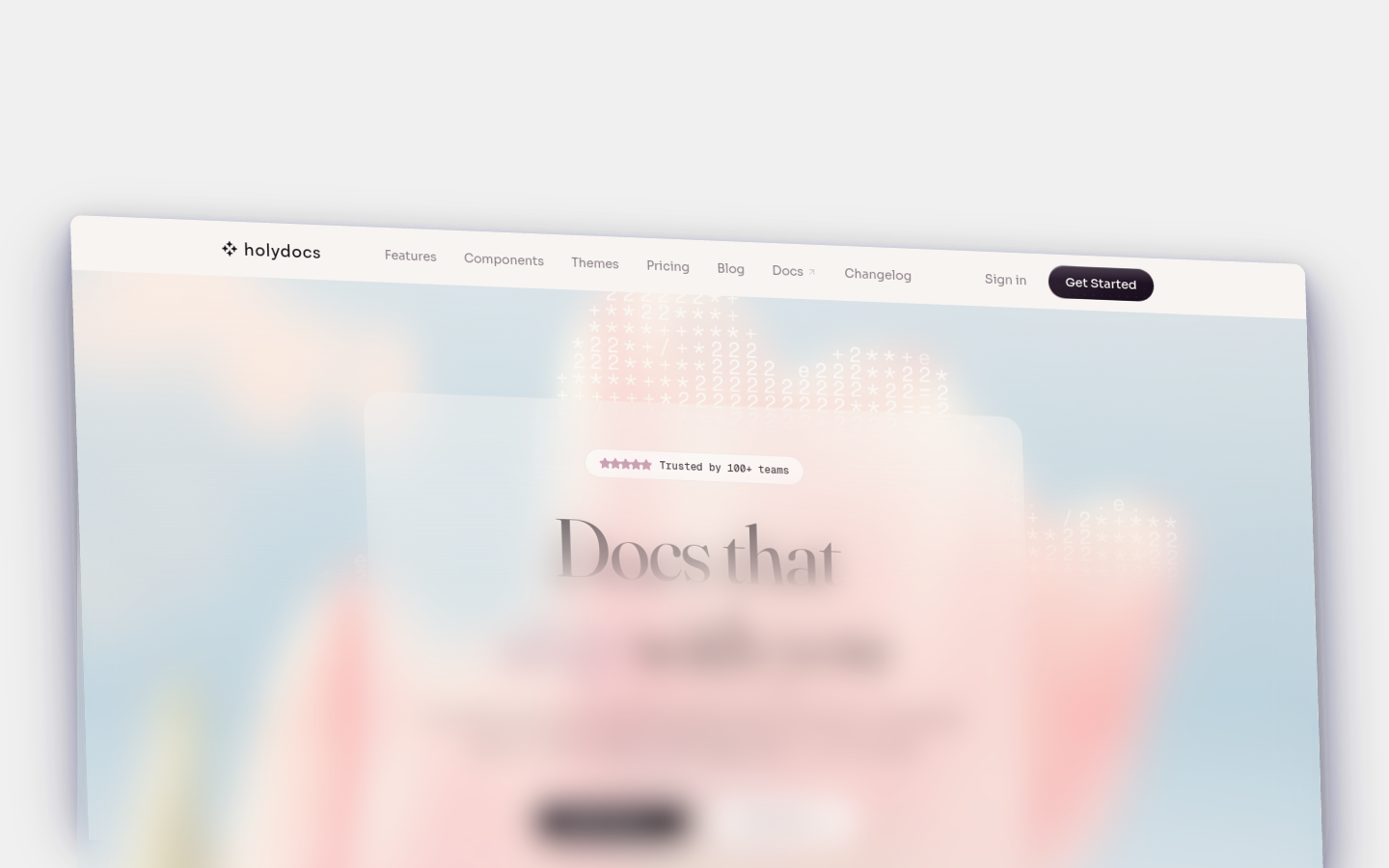
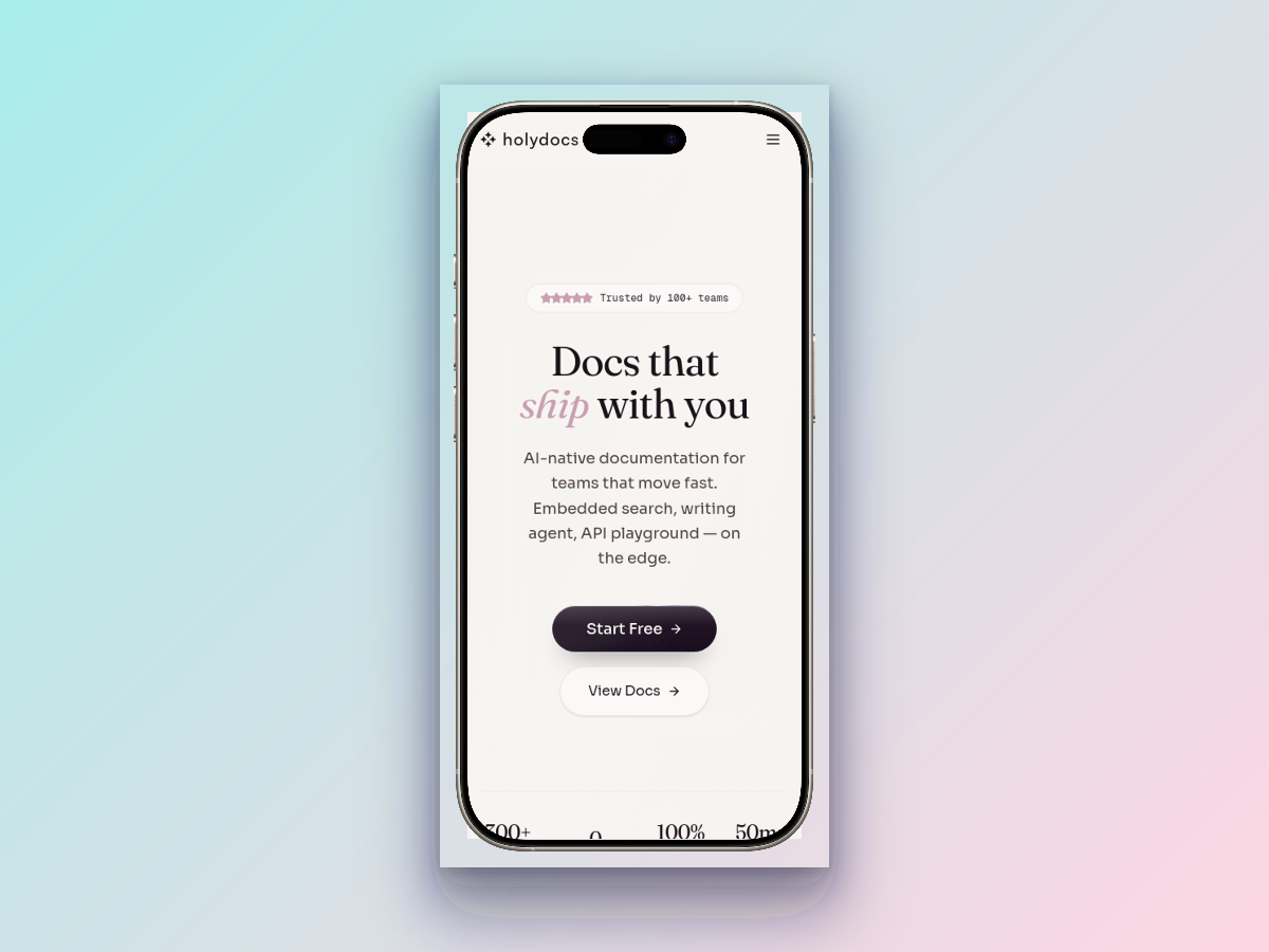
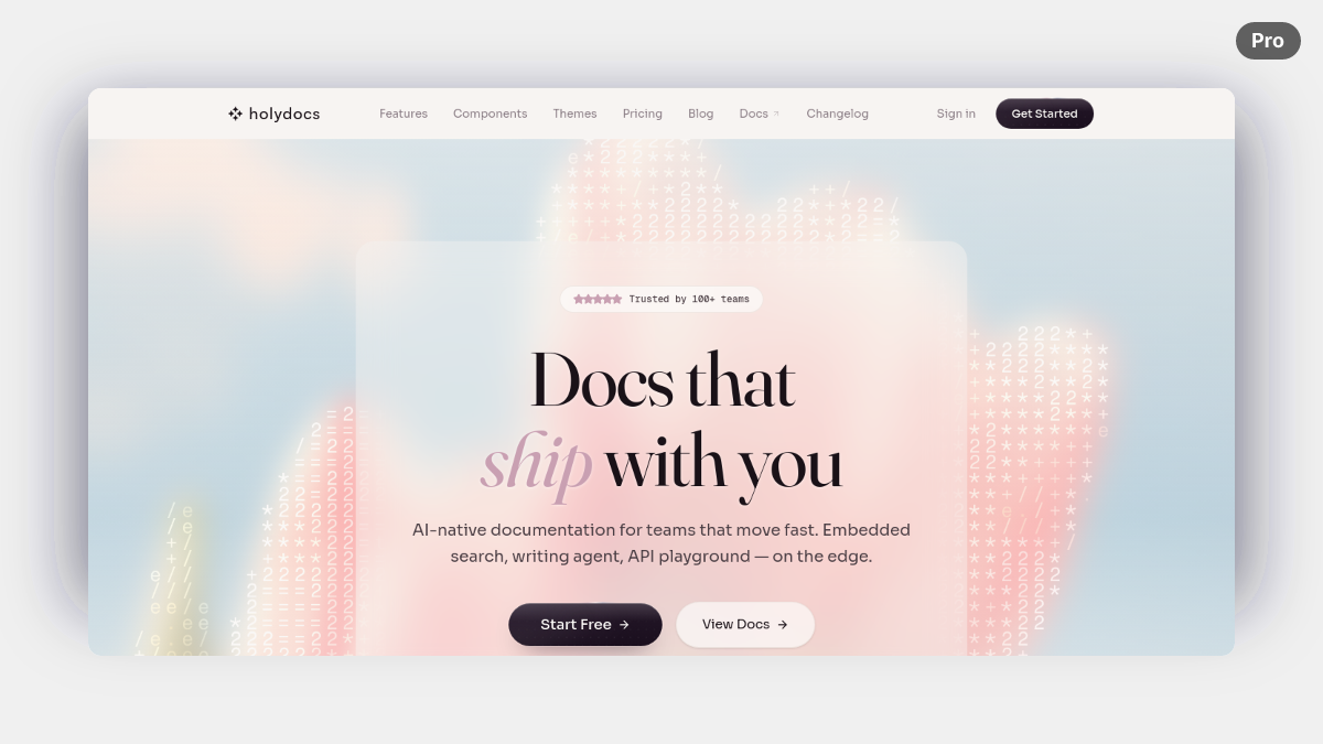
Three-slide screenshot carousel with captions.
**Landing page**
**Device mockup**
**AI composition**
~~~mdx


 ~~~
## Props
| Prop | Type | Default | Description |
| --- | --- | --- | --- |
| `autoplay` | `boolean` | `false` | Automatically advances through slides. |
| `interval` | `number` | `4500` | Autoplay interval in milliseconds. |
## Usage
Start from this baseline shape and then tailor the copy, data, or nesting to the page you are writing.
~~~mdx
~~~
## Tips
- Explain what changes when a reader interacts with the component. Motion or controls alone should not carry the full meaning.
- Keep a non-interactive fallback in mind for screenshots, exported docs, and AI-driven readers that only see the resulting HTML.
- Verify keyboard behavior and focus states whenever the component includes inputs, toggles, or draggable controls.
## Related Components
**[Color](/components/color)**
Visual color swatch with hex value and optional name, useful for design system documentation.
**[Form](/components/form)**
Embeddable forms that collect user input and send it via email.
**[Prompt](/components/prompt)**
Display pre-built AI prompts with a one-click copy button for easy reuse.
## More
- Interactive playground: [Carousel on holydocs.com](https://holydocs.com/components/carousel)
- Component library index: [/components](/components)
~~~
## Props
| Prop | Type | Default | Description |
| --- | --- | --- | --- |
| `autoplay` | `boolean` | `false` | Automatically advances through slides. |
| `interval` | `number` | `4500` | Autoplay interval in milliseconds. |
## Usage
Start from this baseline shape and then tailor the copy, data, or nesting to the page you are writing.
~~~mdx
~~~
## Tips
- Explain what changes when a reader interacts with the component. Motion or controls alone should not carry the full meaning.
- Keep a non-interactive fallback in mind for screenshots, exported docs, and AI-driven readers that only see the resulting HTML.
- Verify keyboard behavior and focus states whenever the component includes inputs, toggles, or draggable controls.
## Related Components
**[Color](/components/color)**
Visual color swatch with hex value and optional name, useful for design system documentation.
**[Form](/components/form)**
Embeddable forms that collect user input and send it via email.
**[Prompt](/components/prompt)**
Display pre-built AI prompts with a one-click copy button for easy reuse.
## More
- Interactive playground: [Carousel on holydocs.com](https://holydocs.com/components/carousel)
- Component library index: [/components](/components)